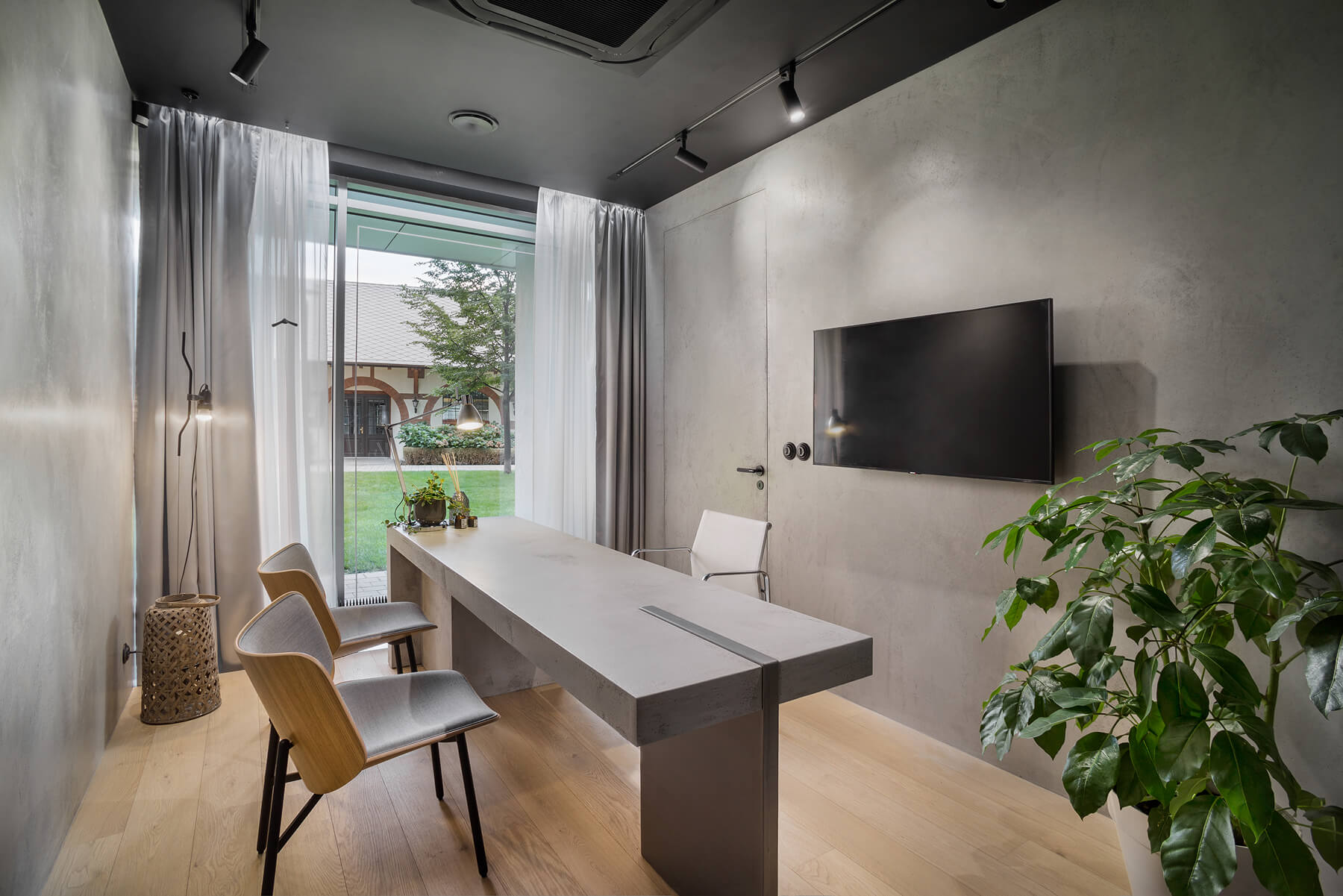
Grey is anything but boring. It is the language of space – quiet, confident, luxurious, minimalist, or dramatic depending on how it is used. And when it comes to concrete plaster, choosing the right shade of grey can completely transform the feel of an interior.
Many people simply say, “I want a grey concrete plaster finish.” But the difference between one shade of grey and another can be far greater than it first appears. The final look is defined by three key elements: the lightness of the shade, its undertone, and the texture of the surface. Together, these details determine whether the space feels calm and understated or bold and expressive.
Let us take a closer look at the possibilities offered by Imitace betonu® concrete plaster and the ways this material can shape an interior.
Light Grey: Calm, Lightness, and Airiness
Lighter shades make a room feel larger, reflect more natural light, and create an open, breathable atmosphere. In smaller bathrooms, hallways, or apartments, they instantly bring a welcome sense of lightness.
Their strength lies in their subtlety. Rather than dominating the interior, they create a calm backdrop that allows furniture, wood, and textiles to stand out.
Light grey works beautifully with oak wood, white kitchens, linen, and other natural materials.

Medium Grey: A Modern Classic
This is the shade most people picture when they think of concrete. Balanced, natural, and free from strong warm or cool undertones, it feels grounded, versatile, and timeless.
It gives the interior character without overpowering it, making it an ideal base for a wide range of styles.
From wood and stone to metal details, medium grey combines effortlessly with almost any surrounding material.

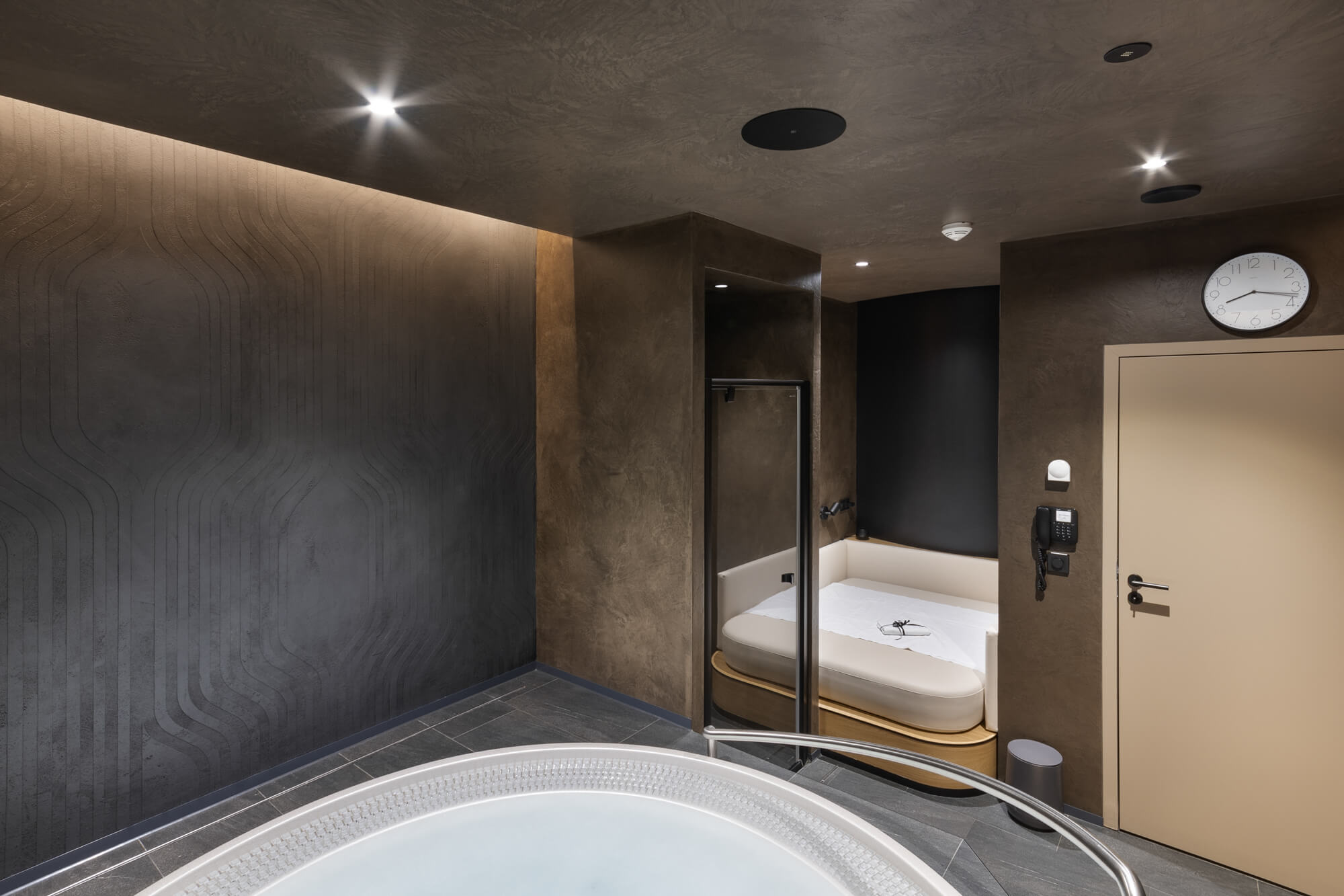
Dark Grey: Character and Depth
Darker shades introduce emotion into a space. They bring luxury, contrast, and a stronger visual presence. Used well, they can create the mood of a boutique hotel or a refined, intimate interior.
Because dark tones absorb more light, they need to be handled carefully. In poorly lit rooms they may feel too heavy, but in interiors with thoughtful lighting they gain richness, depth, and elegance.
Darker shades pair exceptionally well with walnut wood, brass, black accents, and indirect lighting that draws attention to the plaster’s texture.

Warm vs. Cool Grey: A Small Difference That Changes Everything
Grey is not defined only by how light or dark it is. Its undertone matters just as much.
Warm grey carries a subtle beige or taupe note. It feels softer, more natural, and effortlessly creates a welcoming atmosphere. Combined with wood, textiles, and natural materials, it works beautifully in calm minimalist interiors, especially in Japandi-inspired spaces.

Cool grey has a blue or anthracite undertone. It feels sharper, cleaner, and more technical. It stands out in combination with black details, glass, and metal, giving the room a more defined contemporary expression.
At first glance, the difference may seem subtle. In the finished interior, however, it changes the mood completely.

Surface Texture: How Much Life the Finish Carries
Shade is only one part of the story. Texture plays an equally important role in how dynamic or understated the surface appears.
A fine, subtle texture creates a smoother and more elegant impression, allowing the overall composition of the interior to remain calm and cohesive.

A more expressive texture adds movement, energy, and a slightly raw quality. The wall becomes more visible, more readable, and naturally more dominant within the room.

How to Choose the Right Concrete Plaster Finish?
Do not start with a colour chart. Start with the feeling you want the interior to create.
Should it feel cosy or more industrial? Calm or bold? What materials will surround it?
Once this vision is clear, choosing the right shade and texture becomes much easier.
“50 shades of grey” is no exaggeration when it comes to concrete plaster. The same material can feel soft, dramatic, warm, refined, or technical depending on how these details are combined.
That is exactly why there is no single “correct” grey. There is only the grey that makes sense in a particular space.
With Imitace betonu®, we are not limited to just “50 shades”. We work with both RAL and NCS colour systems, giving us almost unlimited possibilities. Every shade is mixed in-house, allowing us to match the plaster precisely to surrounding materials – from flooring and wood tones to the details that define the whole interior.
To make the decision easier, we also prepare custom-made samples for every client so you can see it directly in your own space.
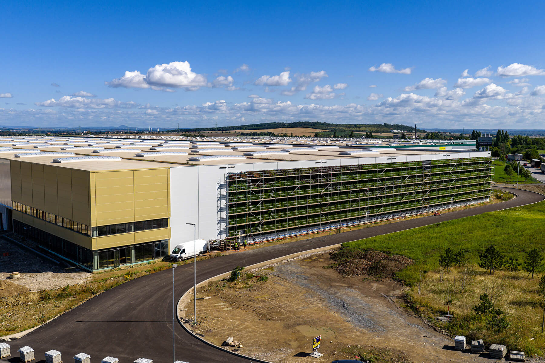
Whether it is a small residential update or a large-scale project, our work always begins in the same way: with a personal approach.